

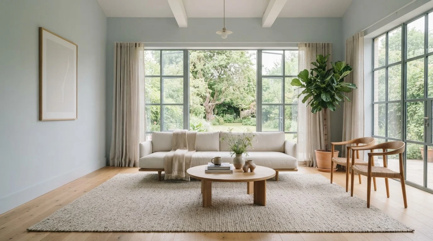
Why Colour Changes How a Room Feels
Walk into a room painted crisp white and then into the same room painted deep navy - the physical dimensions haven't moved, but your perception of the space has changed significantly. This isn't a trick or an exaggeration. Human vision processes colour and light together, and the brain interprets certain visual cues as spatial information.
The key principle is value: the lightness or darkness of a colour. High-value (light) colours reflect more light energy back into the room, which causes the eye to perceive the surface as further away than it actually is. Low-value (dark) colours absorb more light, and the brain reads those surfaces as closer. The result is that light walls appear to push outward, and dark walls appear to pull inward.
This interacts closely with lighting. Natural and artificial light both affect how paint reads on a wall, which means a colour that feels expansive in a south-facing room may feel flat and heavy in a north-facing one. Testing paint samples in your actual space - at multiple times of day - is essential before committing.
~10%
Perceived size change from colour alone
Research in environmental psychology suggests colour and lighting together can alter perceived room size by roughly 10% or more without any physical changes.
3-5 shades
Lighter ceiling tone than walls for height illusion
Interior designers commonly recommend choosing a ceiling colour 2-5 shades lighter on the paint value scale than the chosen wall colour to visually lift a low ceiling.
North vs. South
Light direction changes perceived colour temperature
A north-facing room receives cool, indirect daylight year-round, which can shift warm paint tones toward grey - a factor that meaningfully affects how spacious or warm a colour reads in practice.
Warm vs. Cool: The Advancing and Receding Effect
Beyond value, the temperature of a colour plays its own role. Warm colours - reds, oranges, yellows, and warm beiges - are said to advance: they appear to come toward the viewer, which can make a wall feel closer than it physically is. Cool colours - blues, blue-greens, and cool greys - are said to recede, lending a sense that walls are stepping back.
This is why a small hallway painted a warm terracotta can feel snug (deliberately or not), while the same hallway in a pale sage or soft blue-grey reads as noticeably more open. Neither outcome is objectively wrong - it depends on whether you're trying to create intimacy or airiness.
Understanding this principle also helps when working with open-plan spaces. Colour can be used alongside furniture and rugs to define distinct zones within a single large room, guiding the eye without the need for physical walls.
Test Before You Commit
Buy small sample pots and paint at least two large swatches (12 inches square or bigger) on different walls of the room. Live with them for a full weekend - observe how the colour looks in morning light, afternoon sun, and under your evening artificial lighting. The colour on the tin or a screen will almost never match what it looks like on your wall in your light.
Ceilings, Trim, and the Importance of the Full Picture
Wall colour doesn't work in isolation. The ceiling and trim colours interact with the walls to either reinforce or counteract the size effect you're aiming for.
- Ceiling colour: A ceiling painted slightly lighter than the walls draws the eye upward and increases perceived height. Painting it the same dark shade as the walls creates an immersive, cave-like atmosphere - effective in some contexts but not ideal for most living areas.
- Trim colour: White or near-white trim around doors, windows, and baseboards creates visual contrast that defines boundaries - which can make a room feel more structured. Painting trim the same colour as the walls reduces these interruptions and allows the eye to travel more freely, which can read as more space.
- Accent walls: A single darker or more saturated wall can shift perceived proportions. Darkening the far wall of a long, narrow room can make it feel shorter and more balanced. Darkening a side wall, by contrast, tends to make that wall feel closer and the room narrower.
For practical guidance on actually applying paint cleanly and efficiently, see our room painting guide for families.
Applying These Principles in Everyday Family Spaces
Theory is useful; practical application is better. Here's how these principles translate room by room:
- Small bedrooms
- Light, cool neutrals on all four walls plus the ceiling in an even lighter tone can make a compact room feel like a genuine retreat rather than a cramped box. Avoid strong warm colours on all four walls unless the goal is intimacy.
- Narrow hallways
- Paint the end wall in a slightly darker shade than the side walls. This tricks the eye into perceiving the end of the hallway as further away, making the corridor feel longer. Using a cool tone on the side walls widens the perceived space.
- Low-ceilinged rooms
- A ceiling painted white or a very pale version of the wall colour reflects light downward and visually raises the ceiling line. Avoid dark ceilings in rooms that already feel compressed vertically.
- Large, open rooms that feel cold
- Warm, medium-value colours - soft taupes, muted terracottas, warm greiges - add a sense of enclosure and comfort to oversized spaces without making them claustrophobic.
Keep in mind that paint is just one variable. Furniture placement has its own significant effect on perceived space, and the two work best when considered together. If the room still feels off after repainting, lighting quality may be the issue rather than the colour itself.
Frequently Asked Questions
Not necessarily. Dark paint does draw walls inward visually, creating a more enclosed feel. But in a very large room this can actually make the space feel more inviting and proportioned rather than overwhelming. The effect also depends heavily on lighting - a dark room with good lighting reads very differently from one that is poorly lit.
There is no single universally 'best' colour, but light, cool-toned neutrals - such as soft whites, pale greys, and light blue-greens - are consistently associated with a sense of spaciousness. Matching the trim and ceiling to a similar tone further reduces visual interruptions and extends the sense of depth.
Yes. Matte and eggshell finishes absorb light and soften imperfections, making walls feel more recessive and walls. Gloss and satin finishes reflect more light, which can amplify both the brightness and the colour intensity of a wall. In small or dark rooms, a satin finish can help bounce light around more effectively.
It depends on your goal. Matching ceiling and wall colour creates a cocooning, immersive effect that can work well in dining rooms or bedrooms. For most family living spaces, painting the ceiling a lighter shade than the walls is a reliable way to increase perceived ceiling height and keep the room feeling open.
Natural light changes throughout the day and varies by the direction a room faces. North-facing rooms receive cooler, indirect light that can make warm paint tones look muted. South-facing rooms get strong warm light that can intensify already warm colours. Always test paint samples on your actual walls at different times of day before committing.
The content provided on our blog site traverses numerous categories, offering readers valuable and practical information. Readers can use the editorial team’s research and data to gain more insights into their topics of interest. However, they are requested not to treat the articles as conclusive. The website team cannot be held responsible for differences in data or inaccuracies found across other platforms. Please also note that the site might also miss out on various schemes and offers available that the readers may find more beneficial than the ones we cover.